Style
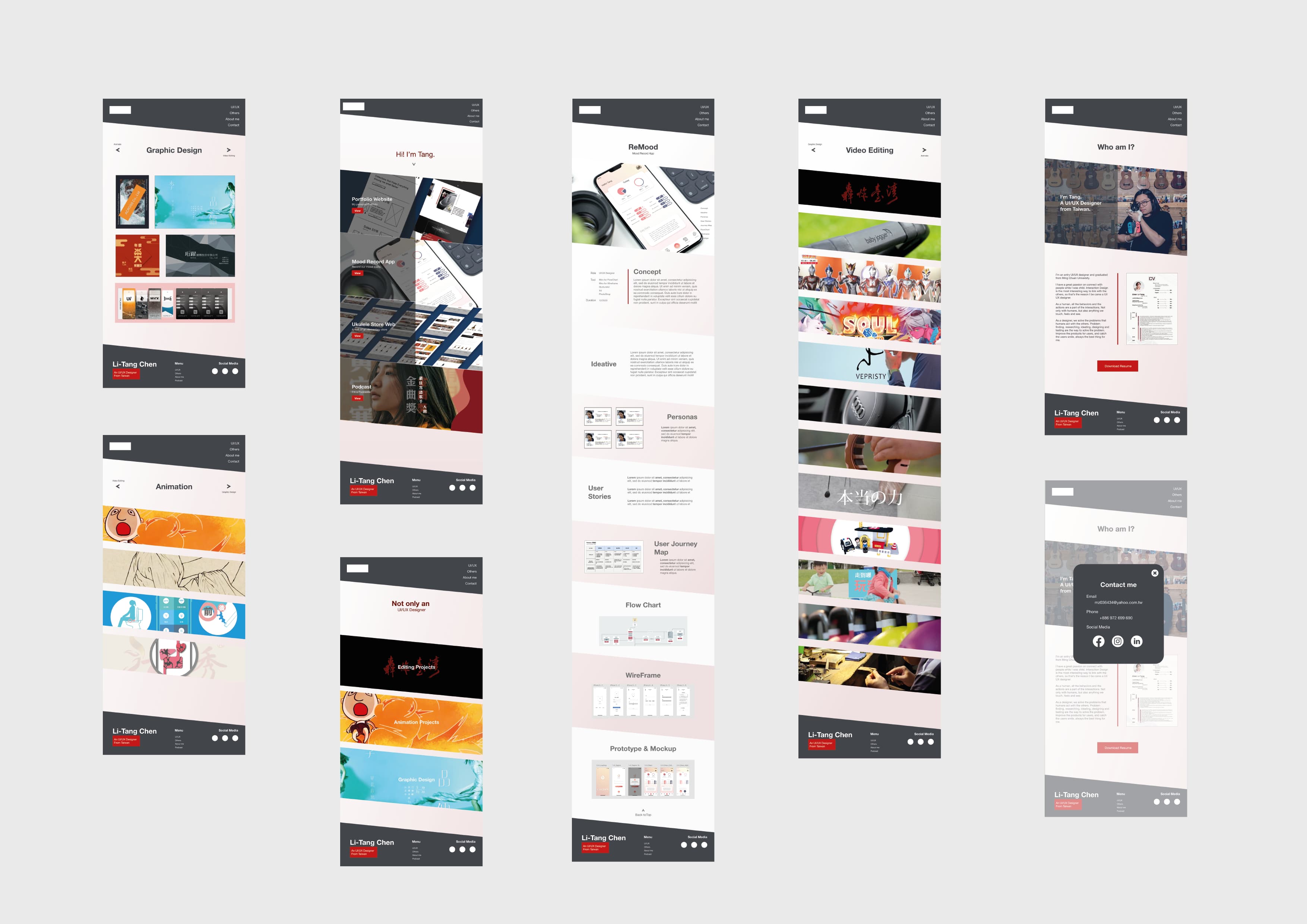
To create a unique portfolio website, how to make users more focused is my main idea for this project. Oblique rectangle is the main element of the website, changing the angle of the figure a bit can make a big difference in the visual presentation. The color chooses are dark gray and dark red with a little pink, presenting the image of stability and innovation.
Color
Interaction
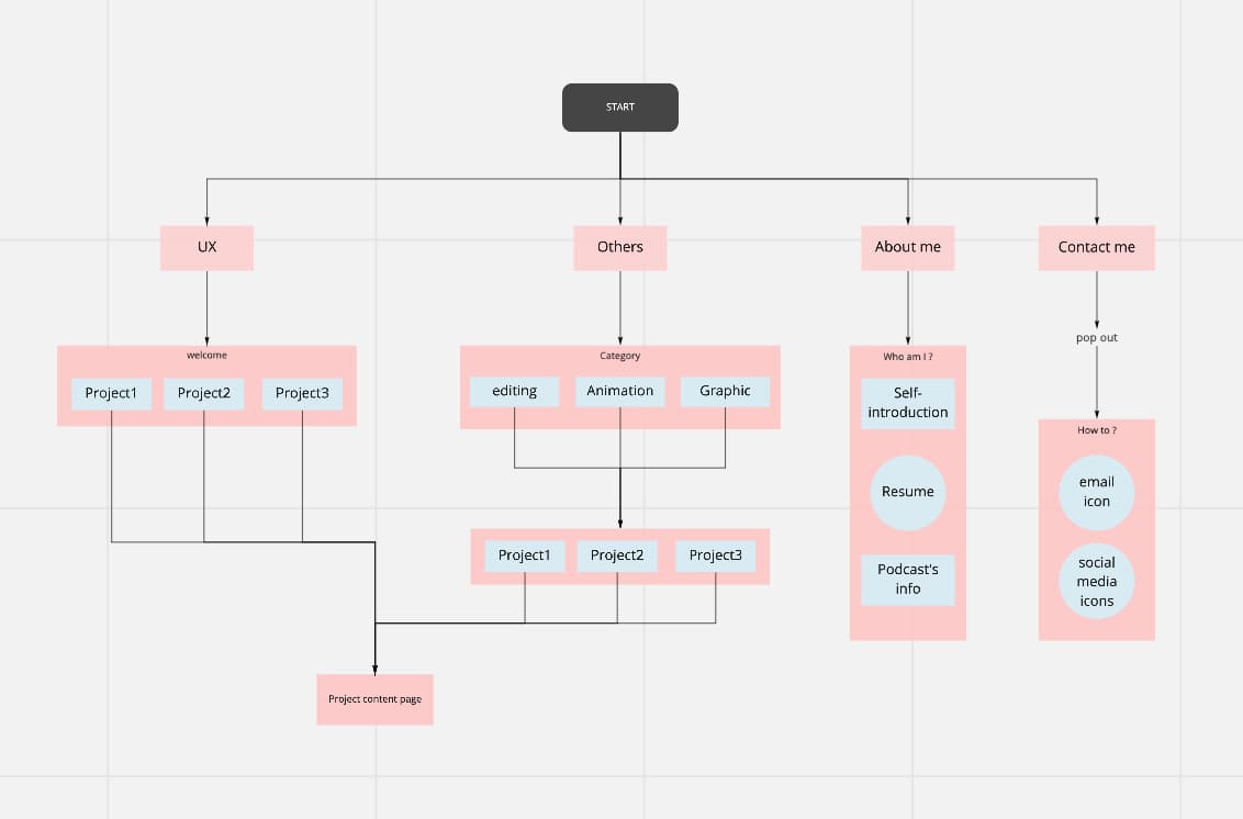
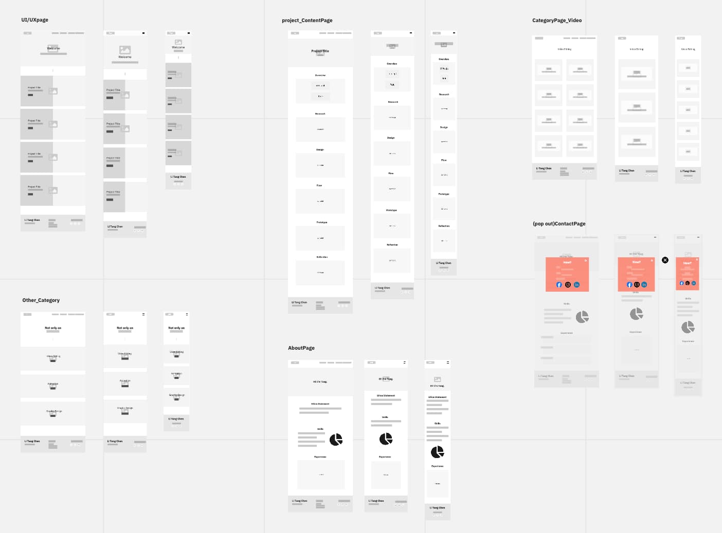
First, I used an oblique rectangle on my website's header to create more space to set the menu in right-angle direction. The design makes this website look simpler and easier to use. Compared to using the hamburger menu, users can click items in the menu more conveniently.
Second, I used diverse CSS effects on the category items, for example, on the ‘UI/UX’ page, the effect used is Parallax Scrolling, and it is a great type to increase the quality of the preview boxes; on the ‘Animation projects’ page and ‘Editing projects’ page, the image will enlarge when users move their cursor on the preview blocks.
Last but not least, the pop-out effect is applied to the ‘Contact me’ page, so the user can browse the info at anytime without changing pages.